New feature: Graph details
RedisGreen’s dashboard graphs have always been one of our most useful tools for monitoring and improving the performance of Redis. Today, we’ve made them even more useful with the addition of several great features.
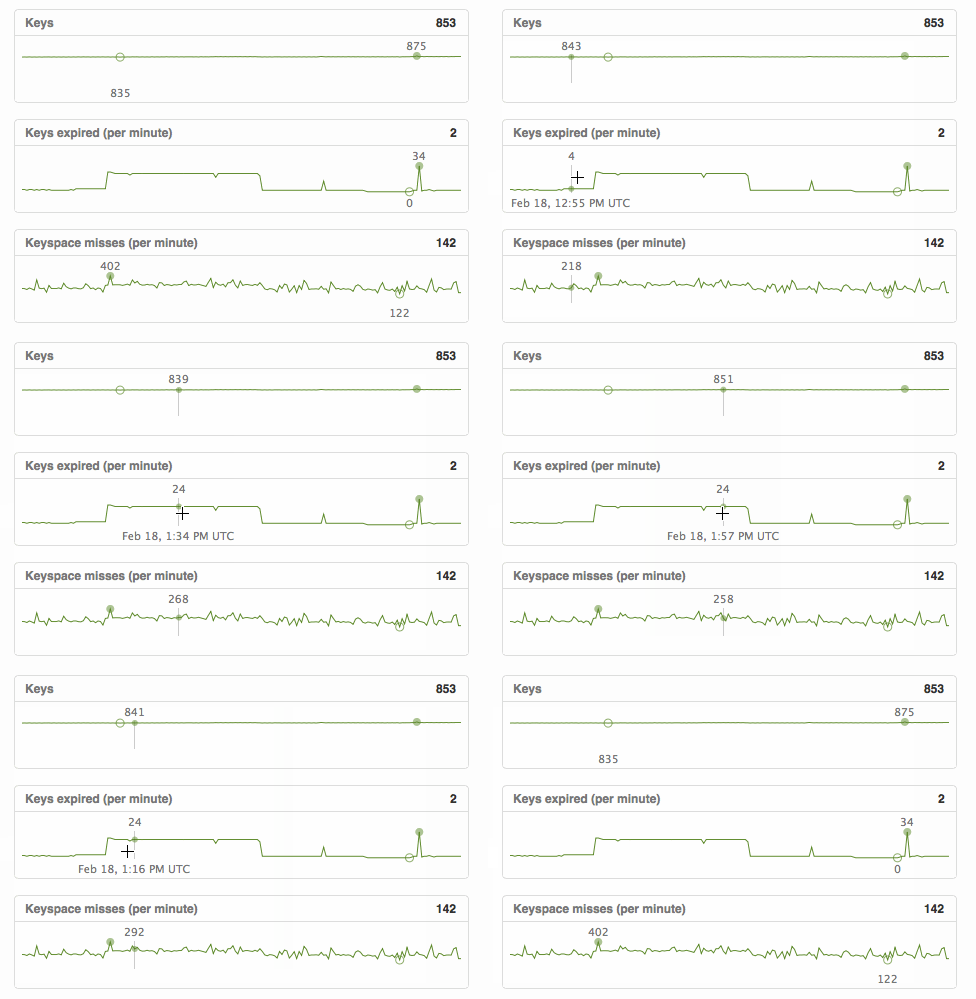
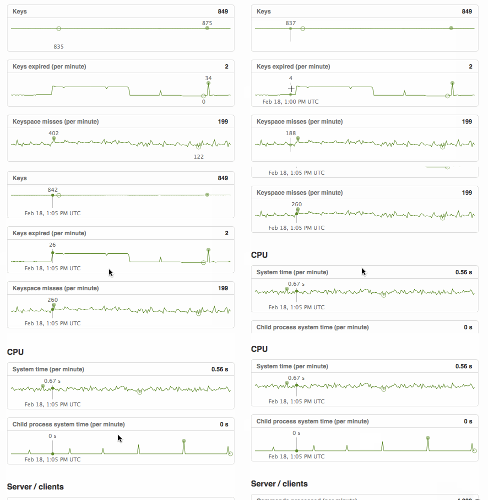
First, all graphs now highlight their minimum and maximum values. This makes it easy to visualize the range of values displayed and to spot potential problem points.

To make correlation between graphs easy, graphs now display a marker below your cursor when you hover over them. This marker displays the value and timestamp for that point on all graphs.

You can also click on graphs to “pin” a marker at that point. When you pin a marker, the graphs will pause and allow you to scroll through all graphs to view the values at that point on all graphs.

We hope you find these new features as useful as we already have! If you have ideas on how we can make graphs even more powerful, send us an email.