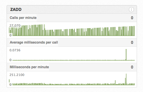
Update
We have replaced the “Time per minute” graphs under the “Command Graphs” tab with “Milliseconds per minute” graphs. This graph is similar, except it shows the absolute number of milliseconds spent running each command every minute rather than the percentage of each minute spent running each command.

Over time, we’ve found that the total number of milliseconds spent per minute running each command is a much easier way to visualize the relative usage and performance of each command that you run, rather than just displaying a flat line and “< 0.001%” all the time.
Could we make the graphs more useful? Send us an email!